Design Systems
I have a deep passion for design systems because they create a cohesive experience for users while simplifying the design process. By understanding and utilizing patterns, we can reduce cognitive load, making workflows more intuitive and efficient. Accessibility is a key focus for me, and I prioritize building a11y-friendly features directly into components to ensure inclusivity is an integral part of the product.
Inclusivity
〰️
Coheisive Experience
〰️
Efficiency
〰️
Simplicity
〰️
Inclusivity 〰️ Coheisive Experience 〰️ Efficiency 〰️ Simplicity 〰️

Weave Messaging App
When I joined Weave in 2020, our design system was sparse and UI-focused. As Weave grew and rebranded, the need for a scalable, UX-driven system became urgent. I led the redesign of the Messaging App components, creating the foundation for a unified inbox.
My Role: UX design · Component architecture · Documentation · Team collaboration
The Problem
Legacy system: unorganized, inconsistent, UI-focussed.
Branding had shifted but components hadn’t caught up.
Developers rebuilt similar pieces from scratch.
Users wanted a single, unified inbox but the existing app couldn’t scale.
User & Business Needs
Core Messaging Functionality: delivered, not delivered, scheduled, loading
Call States: answered, missed, abandoned, voicemail
Content Types: text, images, emails, reviews, forms
User Context: avatars, names, dates, grouping, tags
Actions: delete, retry, download, view
Process
We were getting feedback from our users about how they wanted a unified inbox where they could see all notifications in one place. This feedback led to the idea of having the messaging app be that unified inbox.
Audit: captured existing styles and inconsistencies.
Ideation: mapped which products should feed the unified inbox.
UI foundations: used the new brand’s typography, colors, and button styles.
Component design: explored layouts, edge cases, and scalability.
Accessibility: tested WCAG contrast, focus states, keyboard nav.
Collaboration: aligned with devs and product on discovery, design, and handoff.
Final Components
Standardized message bubbles for text, media, and system messages
Clear, accessible states: sending, loading, error/retry, scheduled
Context menus with quick actions
Consistent grouping and tagging
Flexible enough to support future content types
Documentation & Handoff
General spacing/alignment rules
Edge-case states (failed, retry, scheduled)
Action patterns (delete, download, retry)
Component use cases
Additional Design System Work
Company: Weave
Year: 2023
Role: Senior UX Designer — Design System Lead
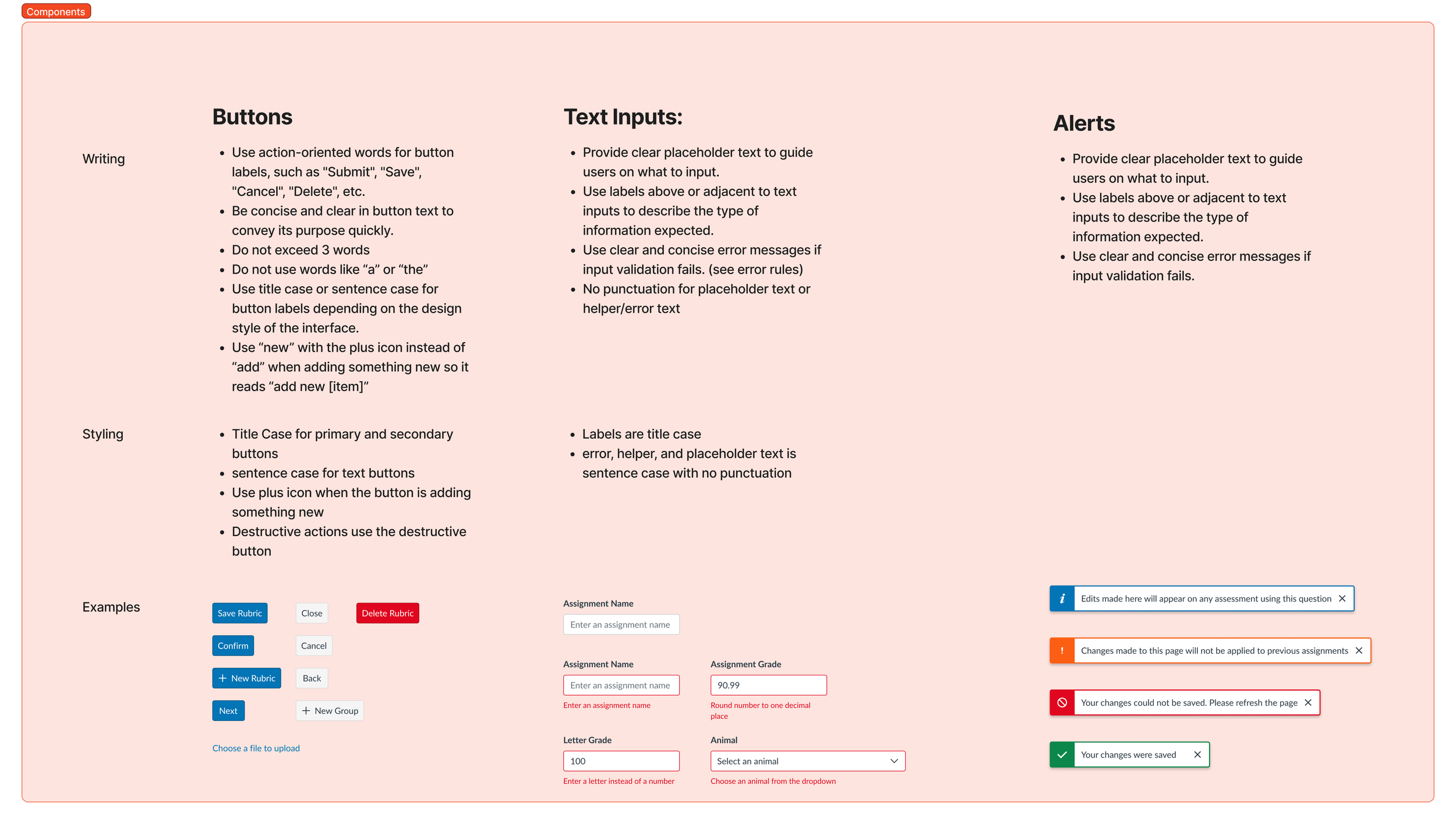
Weave Chip Component
As part of expanding Weave’s design system foundations, I designed and documented a comprehensive chip component library to support tagging, labeling, and filtering interactions across the product.
Problem
Teams across the org were using inconsistent chip styles (e.g., for filters, tags, and statuses), leading to inconsistencies, redundant variants, and unclear interaction patterns.
Approach
I audited existing chip usages, then created a unified structure broken down into four primary classes:
Class Interactive — Clickable and actionable chips (e.g., add new, dismissible, dropdown, select).
Class Icon — Chips with leading icons for quick scanning (e.g., status and state indicators).
Class Label — User-created, color-coded chips for categorization.
Class Status — Static, predefined chips for data tables, filters, and statuses.
Each class was designed with hover, focus, and disabled states, plus guidance for usage within forms and data-heavy UI patterns.
Outcome
Reduced chip-like components from 3-4 to one seamless component with defined variants.
Improved consistency and reusability across feature teams.
Created scalable documentation with visual and interactive examples to help designers and engineers implement correctly.
Company: Instructure
Year: 2024
Role: Senior Product Designer
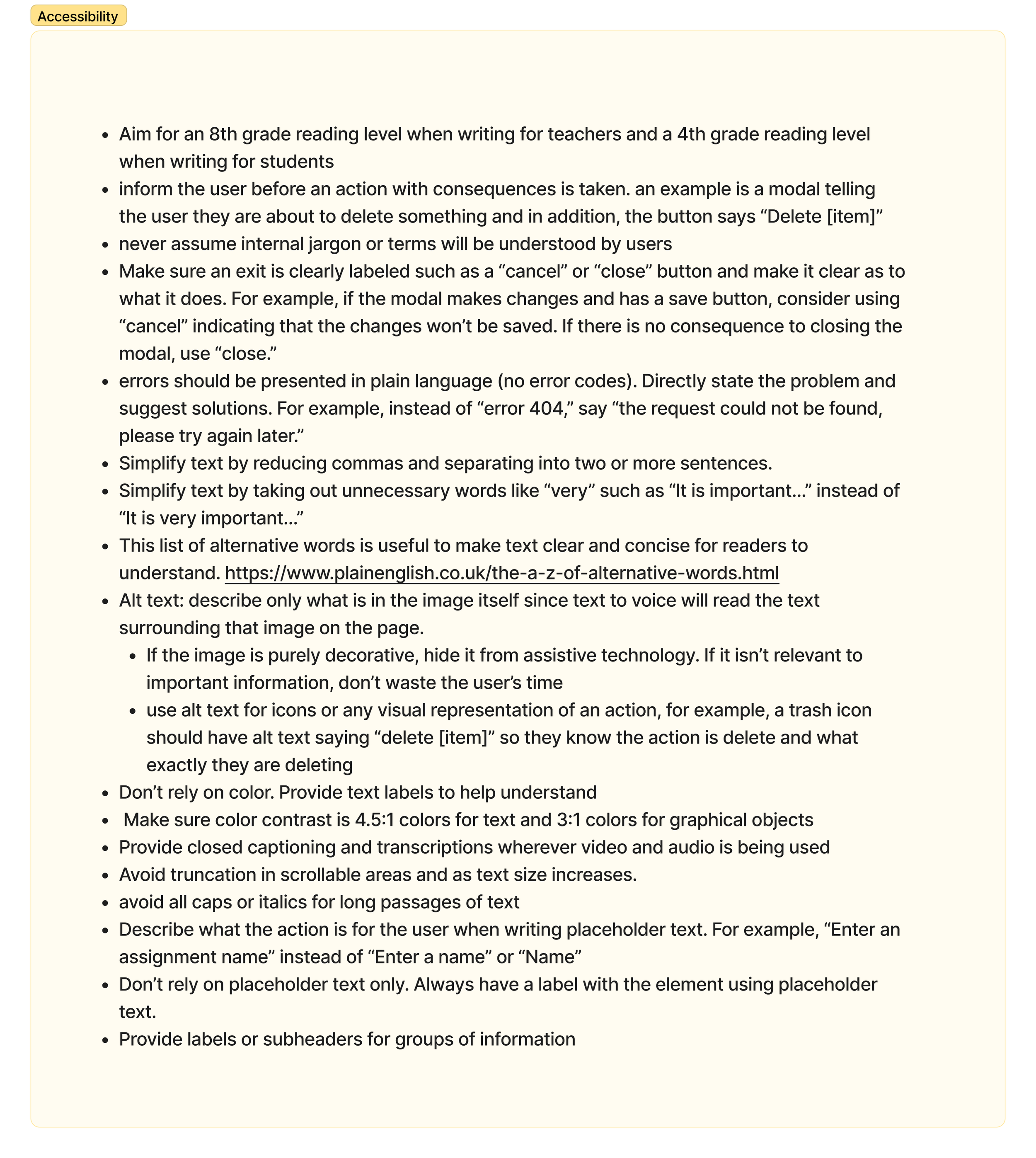
Voice & Tone and Language Mechanics
Researched other design systems, components, and documentation
Audited and analyzed our existing voice for Instructure, ensuring the inclusion of our branding team
Established voice & tone, guidelines for 9 different language mechanics, and inclusive and accessible language principles.
Began implementing examples of how the new language guidelines would fit into existing components.
Collaborated with other Design System team members and all designers.